Dashboards
First Dashboard
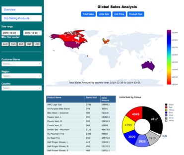
In the first instance, I turned to Power BI, the market leader, but being a Mac user this was not straightforward: Running Windows 10 on a virtual machine, Power BI was painfully slow on my 2009 iMac and there is (as yet) not a version compatible with my 2020 Mac Book Air (Apple M Series Chip). I therefore opted for Python Dash to build the first report required by the course (The Complete Power BI Practical Course 2022 on Udemy).
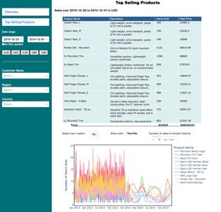
In this task there are 60,000 transactions for 18,000 customers in Australia, North America and Europe (France, Germany and, ahem, the UK). The dashboard shows the sales, which can be filtered by date range and currency. In addition to the required Total Sales, I went a little further and added filters for Units Sold, Unit Price and Product Cost, as well as ensuring that the date and currency filters applied to all components on both pages. Additionally, on the second page (Top Selling Products), I also added a smoothing function to the plot showing the total number of items sold.
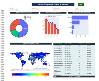
Second Dashboard
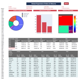
This is Practical Task Three of The Complete Power BI Practical Course, based on the “Global Superstore Returns” file, which also appears to be one of the Tableau exercises (which I had to fetch, not being able to read a pbix file).
Again all of the components where included, a particular highlight getting a collapsable/expandable table to work.
Lastly, out of curiosity, I ran a clustering analysis on the customers and from Principal Component Analysis find four distinct groups (view here).
One challenge was the pop-up modal, although the final result was clearer than the original (click on a country on the world map). Although perhaps not the prettiest design, my goal was to emulate the dashboard in the assignment.
I was impressed by how much of this could be done in python. Also, by using python:
-
• All of the pre-processing (cleaning, manipulation and cross-matching between tables) could be done in pandas.
-
• Operations (such as currency conversion and date filtering) could be performed without long and complex syntax.
-
• The analysis is much more robust by avoiding the usual pitfalls when using spreadsheets.
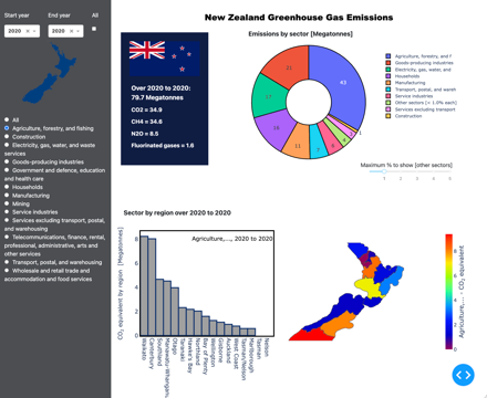
New Zealand Greenhouse Gas Emissions
From StatsNZ I downloaded the three available Greenhouse Gas Emissions datasets, finding “Greenhouse gas emissions by region, industry and household: Year ended 2021 – CSV” to be the most comprehensive, containing data on each of the main greenhouse gases by sector and regions over 2007 to 2021 (although some cleaning was required, as this contained overlapping sectors and CO2 and CO2 equivalents, leading to multiple counts).
The dashboard can be accessed be accessed here (or by clicking on the screenshot).
Again, using python dash, I built the dashboard, from which it is seen that “agriculture, forestry and fishing” is New Zealand's largest greenhouse emission sector (with agriculture being by far the most dominant).
Also, the Waikato and Auckland are the highest emitting regions overall.
Lastly, by combining the data with population numbers, it is seen that there has been a decrease in emissions per capita over this period (from 19.3 in 2007 to 15.6 tonnes per capita in 2021). However, the total amount remains roughly constant.